field
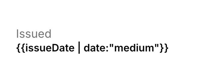
A caption paired with its value, stacked vertically or set side by side, each with its own size, weight and colour.
When to reach for it
Against a plain text element containing Label: {{token}}, the deciding factor is styling: field styles the caption and the value independently and can switch between stacked and inline, whereas a text element gives you one style for the whole run.
There is no field picker property — the value is an ordinary string that binds only through a {{token}} you put in it, and it starts empty, so a new field shows its caption and nothing else.
Properties the tour sets
Only what the Component Tour changed from this element's defaults — everything else is left as-is. It sits in the report-header band.
| Property | Value |
|---|---|
label | Issued |
value | {{issueDate | date:"medium"}} |
valueFontSize | 9 |
Open the Component Tour → to see this element alongside all the others.